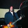
elduave Posted June 14, 2006 Posted June 14, 2006 IMO, the Ultimate Standard is Rick Nielsen's #0004. It was that guitar and Cheap Trick At Budokan that lit the Hamer fire for me. I ordered up 3 pieces inspired by it as a "Rocketeria Run". Dig it: They're Standard Customs with unbound dot necks, Grovers, Dimarzio PAF's in the bridge position (for the "look") and most importantly, the color matched to the pic from Bill Rich's "Guitars Of The Stars-Rick Nielsen" book (nailed). Bro Chris had the genius suggestion to have the Hamer logo moved to the tip of the headstock. I was unsure at first and almost cancelled the option, but now I'm *really* happy it's where it is. Thanks Chris! Once in production, Jol dug in. He saw what I was trying to achieve and suggested ABS binding instead of Ivoroid. ABS is what was used on the early Standards (LP Standards as well). We talked about Rhythm/Treble washers and Sha-Zam, they were added at the factory. Take a good look at the logo above. That's right, it's aged/yellowed (another unprompted tweak by the factory)! Thanks Jol and crew! Somewhere along the way, Jol refered to the guitars the "Zander Standards". I was like, huh? Apparently, #0004 was originally made for Robin Zander but was absorbed into Rick's collection. The guitars had a name. It's a good name. The COA's even say Color To Match "Robin Zander" Guitar They have consecutive serial #'s. I'm keeping the one on the right in the Peers family. I hope the eventual owners of the other 2 hold them as dearly as I'll hold mine. A hearty cheers to Hamer, Cheap Trick & the HFC!
Mobster Posted June 14, 2006 Posted June 14, 2006 Holy Cow, Dave! They are awesome.....I guess I'll be calling you tomorrow.....Great vision, and great execution!
LordOfTheThighs Posted June 14, 2006 Posted June 14, 2006 OH BABY!!!Great idea ... love'em! That's a really interesting tidbit of info, thatthe original one was made for Zander ... cool stuff ... thanks.
Gabe Posted June 14, 2006 Posted June 14, 2006 Very very nice. And I like the look of the washer rings on the rhythm/treble switch. Gabe
Disturber Posted June 14, 2006 Posted June 14, 2006 Bro Chris had the genius suggestion to have the Hamer logo moved to the tip of the headstock. I was unsure at first and almost cancelled the option, but now I'm *really* happy it's where it is. Thanks Chris! You have brought a grown man to tears... Movint the logo was a GENIOUS move. This is where it's supposed to be. It looks soo cooooool !!!! And the colours of those guitars are just right. "I want you I need you I got to be near you ohh you're a strange kind of hamer.."
bruce919 Posted June 14, 2006 Posted June 14, 2006 Damn, I love the look of thoes. Very well thought out.But as as always I have no $$ right now. Will you take $10 a week until it paid off? LOL. That should be a Hamer opt. for a Standard or even an unofficial model. The "Cheap Tricked-out" Standard. Very Very cool.
ajay315 Posted June 14, 2006 Posted June 14, 2006 Amazing. That one in the middle of the first pic: yeah, I'm gonna be wanting that for my birthday. Whch is only 9 months away. Which is plenty of time for you guys to pass around & sign a card.
Travis Posted June 14, 2006 Posted June 14, 2006 Very, very cool. If I had the need for a Standard, I would be giving you a call later today. I have no doubt those will not be at your store for long. Nice going.
sw686blue Posted June 14, 2006 Posted June 14, 2006 Amazing guitars Dave! The one on the left looks killer.Cheers!
musicman Posted June 14, 2006 Posted June 14, 2006 I know it has already been typed but WOW!!!These are cool guitars.These guitars could be called signature or reissue series/models.How come Hamer doesn't offer signature/reissue guitars in line or at the very least special runs a couple times during the year.Hamer chooses the model, amount of run, s/n 1 of , 2 of, etc.Just wondering.
Mike_C Posted June 14, 2006 Posted June 14, 2006 Dave you hit a homerun. Hands down the coolest new standards I've seen in a long while. And the repositioned logo is just great. I wish I had the scratch to get one of them.
tafkathundernotes Posted June 14, 2006 Posted June 14, 2006 Double Bitchin'!+1 on the logo move too. I like the yellow tint.
MCChris Posted June 14, 2006 Posted June 14, 2006 My hat's off to you Dave. Perfect in every respect.
cmatthes Posted June 14, 2006 Posted June 14, 2006 Having seen all three in the flesh, I can attest to the fact that the tops are really vivid in person. Very 3-D - the photos actually understate that a bit.They did a great job with the color matching too, as Dave mentioned, and the aging of the binding and logo really makes "the look".There will be three very happy owners of new (old!) Standards out there...all three are fantastic players.Oh, the consecutive Serial #s are also cool - #78, #79 and #80.
silentman Posted June 14, 2006 Posted June 14, 2006 The one on the left is cool. Did they do the regular thickness top or did they use a thinner veneer?
Recommended Posts
Archived
This topic is now archived and is closed to further replies.