RobB Posted September 28, 2014 Posted September 28, 2014 I like the original placement, like an explorer as God intended.
cynic Posted September 28, 2014 Posted September 28, 2014 It is neither .... or....., but it feels right, it is mine.That right there in bold is what I want; something that feels right to the master builder, and something he's proud of and excited to call his own.Plenty of used Hamer's on the market with all sorts of various logo sizes and placements if that's what you want.If you want the Shishkov, embrace the Shishkov.
cmatthes Posted September 28, 2014 Posted September 28, 2014 Please keep in mind - this is not a design by committee. This is MIKE'S vision, and ultimately Mike's execution of his vision.As has been more than amply demonstrated here, if everybody on the HFC had input, there would never be a consensus.This is SHISHKOV GUITARS, not HFC Guitars!
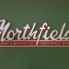
BTMN Posted September 28, 2014 Posted September 28, 2014 I like it but would LOVE it were the first S lined up under the B tuner with just a touch more Black after the USA. It is your baby though and I will play mine with the logo most anyway you wanna put one on. Just so you get my original opinion, and understand I was not soliciting my idea be rule, or even voted on. Just my thought in response to Mike's question. He did ask.
polara Posted September 28, 2014 Posted September 28, 2014 Please keep in mind - this is not a design by committee. This is MIKE'S vision, and ultimately Mike's execution of his vision.As has been more than amply demonstrated here, if everybody on the HFC had input, there would never be a consensus.This is SHISHKOV GUITARS, not HFC Guitars!If input is not wanted, then Mike should not say at the end of the post, "What do you guys think?"I'm a little puzzled by the kind of flare at the borrow of the head where it widens right before the nut. Not knowing how guitars are made, I'm assuming that gets shaved away later.I'm diggin' the balance between a nod to Shishkov Guitar's roots while not being a dead-on copy. I figure if they turn out half as cool as the Hello Kitty guitar Mike made a couple years back, these will be deadly.
RobB Posted September 28, 2014 Posted September 28, 2014 I'm a little puzzled by the kind of flare at the borrow of the head where it widens right before the nut. Not knowing how guitars are made, I'm assuming that gets shaved away later.Correct assumption. That will be blended in to the width of the nut/FB.
Northfield Posted September 28, 2014 Author Posted September 28, 2014 I appreciate the thoughtful responses. I haven't decided on the final placement of the logo yet. I am excited about the headstock design I have come up with for the Ultimates, and am glad that the overall response has been positive. The flare by the nut the will get tapered, right now the rest of the neck is still rough shaped.
cmatthes Posted September 28, 2014 Posted September 28, 2014 Yes, Rick. That excess wood gets removed when the neck is carved to final thickness. It provides some extra strength while the headstock is shaped at this point.
chromium Posted September 28, 2014 Posted September 28, 2014 I think the headstock design looks great!Nice work, and thanks for sharing the pics. It's really cool seeing this progress...
JimiH Posted September 28, 2014 Posted September 28, 2014 Please keep in mind - this is not a design by committee. This is MIKE'S vision, and ultimately Mike's execution of his vision. As has been more than amply demonstrated here, if everybody on the HFC had input, there would never be a consensus. This is SHISHKOV GUITARS, not HFC Guitars! Opinions where asked by mike and given in the working man guitar thread, so I think mike may have taken a few of them on board. Hfc guitars can maybe take some of the credit, maybe 1/2%?
DaveL Posted September 28, 2014 Posted September 28, 2014 Been a very busy week behind the scenes. Found my old custom bench sitting in the shipping area of the old shop. Was glad to be able to drag it to my new shop. And then today I found a vintage stool to go along with it. Really starting to feel like home in the shop. Have been playing around with the headstock design for the Ultimates, and have come up with this. It is neither .... or....., but it feels right, it is mine. What do you guys think? cool, still hurts to know that beautiful New England Mill building is empty... headstock looks good. just my opinion, I like the logo where it sits in this pic, kickass. just sayin.
David B Posted September 28, 2014 Posted September 28, 2014 Please keep in mind - this is not a design by committee. This is MIKE'S vision, and ultimately Mike's execution of his vision.As has been more than amply demonstrated here, if everybody on the HFC had input, there would never be a consensus.This is SHISHKOV GUITARS, not HFC Guitars!I'm a little puzzled by the kind of flare at the borrow of the head where it widens right before the nut. Not knowing how guitars are made, I'm assuming that gets shaved away later.That gets carved / sanded away.
kizanski Posted September 29, 2014 Posted September 29, 2014 As someone who has plunked his money down, but also understands his opinion is meaningless, I absolutely love it!
hamerhead Posted September 29, 2014 Posted September 29, 2014 The big oval cutout thing is weird, but the rest of it looks great. Weight relief, Mitch. Looks great, sir! Dammit. I thought it was a speed hole. Looks great, Mike. Gotta be happy with that.
coolfeel Posted September 29, 2014 Posted September 29, 2014 The logo and placement are both classy and classic!
HAMERMAN Posted September 29, 2014 Posted September 29, 2014 Looks great Mike - very glad to see that you didn't feel the need to go overboard trying to make it look distinctly "Shishkov" from a distance.I am talking to you Tyler, G&L and Valley Arts. At one time I probably would have added Parker to that list but upon seeing one in person it made sense so now I like it. :-)
velorush Posted September 29, 2014 Posted September 29, 2014 Looks great Mike - very glad to see that you didn't feel the need to go overboard trying to make it look distinctly "Shishkov" from a distance. I am talking to you Tyler, G&L and Valley Arts. At one time I probably would have added Parker to that list but upon seeing one in person it made sense so now I like it. :-) Excellent point! I am grateful about how nice nicely the headstock is looking. My gosh, to consider the possibility of me having plopped down my deposit and the initial post of this thread had have a photo like this?: I am certain they are fantastic guitars, well above my pay grade and playing ability, and no offense meant to any Tyler owners, but dang! Edited to fix my grammar (man, I'm slipping).
cmatthes Posted September 29, 2014 Posted September 29, 2014 No worries. Even Tyler owners/players hang their heads in shame and put paper bags over those gawdawful headstocks.
gorch Posted September 29, 2014 Posted September 29, 2014 Looks great Mike - very glad to see that you didn't feel the need to go overboard trying to make it look distinctly "Shishkov" from a distance. I am talking to you Tyler, G&L and Valley Arts. At one time I probably would have added Parker to that list but upon seeing one in person it made sense so now I like it. :-) Excellent point! I am grateful about how nice the headstock is looking. My gosh, to consider the possibility of me having plopped down my deposit and the initial post of this thread had a photo like this?: I am certain they are fantastic guitars, well above my pay grade and playing ability, and no offense meant to any Tyler owners, but dang! The extra space is where your ad could be...
Steve Haynie Posted September 29, 2014 Posted September 29, 2014 For all the criticism of the Tyler headstock, the company is still in business after all these years. Apparently something about those guitars is worth putting up with that headstock design. Does anyone else think it has the silhouette of a big camper trailer?
atquinn Posted September 29, 2014 Posted September 29, 2014 No worries. Even Tyler owners/players hang their heads in shame and put paper bags over those gawdawful headstocks. I used to hate Tyler headstocks, but their horrible ugliness grew on me after a while. Kinda like with Telecasters. - Austin
RobB Posted September 30, 2014 Posted September 30, 2014 The truss rod nuts and washers came in today. I think I crossed my own line of sanity by having the washers machined, and I'm just getting started.FukkinA RIGHT you're getting custom washers! I mean, WTF am I paying for, anyway?
Recommended Posts
Archived
This topic is now archived and is closed to further replies.